#004 - Making the Interface Feel Like HyperKourier
The UI in this game cannot just be generic game UI. It has to feel like part of the world.
Making the Interface Feel Like HyperKourier
HyperKourier devlog, May 18, 2026
A lot of today’s work was not about adding one giant new feature. It was about tightening the foundation so the game can keep growing without turning into a pile of disconnected prototype parts.
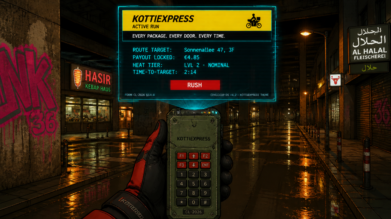
The main focus was the HUD and gig-app layer: the stuff that tells you where to go, what the courier platform thinks of you, how much heat you’re carrying, and how the city is trying to squeeze more labor out of you. Early versions of that interface were useful, but they were still very “prototype UI”: boxes, readouts, helper text, debug-ish panels. Functional, but not yet fully HyperKourier.
So we spent time turning that into a proper visual and interaction language.
The big lesson was that the UI in this game cannot just be generic game UI. It has to feel like part of the world. The gig app is not a neutral menu. It is an employer, a surveillance surface, a comedy engine, a hostile little bureaucracy in your visor. That means the layout, colors, motion, alerts, and copy all need rules. If the game is about surviving algorithmic delivery work in NEUKÖLLN-9, the interface should be one of the ways that pressure shows up.
We also learned something practical about working with multiple coding agents: good canon matters. If the style rules live only in someone’s head, every implementation drifts a little. So part of the work was making the project’s visual playbook easier to access, cite, and build from. That is not glamorous, but it is the kind of thing that lets a small project move faster without losing its voice.
A few concrete pieces moved forward:
- The UI style guide is now much more explicit.
- The gig-app overlay has a clearer state model.
- Route-hack alerts are being pulled into the same visual language as the rest of the HUD.
- Platform messages are getting smarter and more reactive.
- HUD colors, meters, and alert treatments are moving away from prototype literals toward an actual token system.
- The project canon is now easier for contributors and review tools to follow.
The next push is more visible: moving the gig-app shell into its proper “Receipt Strip” position, folding route targets into that surface, and making the results screen feel like part of the same hostile platform experience instead of a separate end screen.
It is still early. The game is still rough, weird, and very much in-progress. But this pass matters because it moves HyperKourier closer to having a real identity on screen: not just a cyberpunk traversal prototype, but a city, a job, a signal, and a system watching you while you ride.